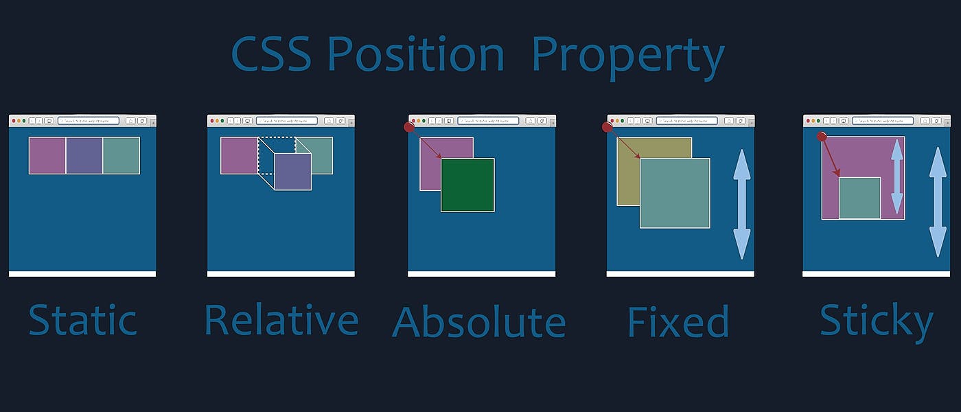
I am a student that recently commenced studying and . I was eager to learn how to apply the styles in the way I see foremost visually appealing as today’s standards. HTML CSS Oh boy did I have a rush to show how simple the Box-Model would apply to my web! That was until I lost 3 hours not being able to format the margins the way I wanted. How a container ‘exploded’ to one side and the format went all-wrong and displeasing! How could this be happening? My beautiful HTML resulted in an ugly rendered webpage! Practice (practice, practice) and a lot of reading did it. So that’s why I want to share with you what I’ve learned this last month. Understanding Positioning: How the ‘document flow’ functions. Before jumping to positioning I talk about the document flow. MUST I’m going to be brief here and not going to dive deep into how browsers render Web-Pages. If you want to know more about this you can start from here: What Every Frontend Developer Should Know About Webpage Rendering The is how its elements are placed after it’s rendered by the browser. flow of the document This is to say. In which way elements take space and how other elements position themselves accordingly. Defined by CSS Positioning statements and the order of HTML elements. Stating this we can now understand what is an “IN-FLOW” and “OUT-FLOW” component of the webpage. You can imagine “IN-FLOW” as one a colorful picture and each element “OUT-FLOW” a tracing paper on top or a sticker pasted over it. We have three ways (properties) of positioning elements: Display Float Position Today I’m going to be taking care of the latter. and . For the other two I recommend CSS Tricks Display All-about-floats POSITION STATIC - ("IN-FLOW") position: static; All positions are static by default. Meaning they take up the appropriate amount of space they suppose to take up. Unless we specify something else. RELATIVE - ("IN-FLOW" / "OUT-FLOW") position: relative; When set to elements take up the same amount of space at the same position it would take as if its position was static. position: relative; Why is it an "OUT-FLOW"? Because the placement can change with the . If you move it the space it occupies will remain the same. But its directional properties render is going to be 'on top' of everything else. ABSOLUTE ("OUT-FLOW") position: absolute; When set to . The element is not calculated within the "IN-FLOW" document. position: absolute; That means it doesn’t take any space within the flow of the document. Although the placement might seem to follow the document flow. As soon as you assign direction properties it will move not caring about its relatives. Relativity: If there’s with , then its ‘starter point’ will be on it. any parent position: relative; If there’s not any parent with position: relative. Its placement will be on the browser window. FIXED (OUT-FLOW): It’s almost the same as . But elements with position fixed is position: absolute; always positioned relative to the browser window. So it will maintain its position regardless if you scroll the webpage. STICKY ("IN-FLOW" / "OUT-FLOW") position: stick; This is the new Sticky position and I need to quote MDN on this one: “Sticky positioning is a hybrid of relative and fixed positioning. The element is treated as relative positioned until it crosses a specified threshold, at which point it is treated as fixed positioned.” As explained above. The item with will ‘stick’ in the position . position: sticky; within its parent container Why is it an "IN-FLOW" and "OUT-FLOW"? calculated initial position. It will until it reaches a defined scroll position. "IN-FLOW": behave like a relative element it will . It will not scroll past any side of its parent. "OUT-FLOW": behave like a fixed element within its direct parent IMPORTANT: you only need to define position: sticky to the item. Its parent will automatically be a sticky container. The scope of the sticky item will be its container (This is the most area that the sticky item can float in). Note: All the elements within the 'OUT-FLOW' are manipulable by . Such as: positioning properties bottom top left right I.e. use bottom: 0; to send the item to the bottom-most of its parent. If you want to manage which one is on top of each other you can use the z-index (stack order) property. An element with greater stack order is always in front of an element with a lower stack order. Or how I like to call it. Which one is going to be closer to your eyes. Conclusion: If you’re new at HTML and CSS like me remember to keep practicing all this and keep thinking in ‘Box-Model’. If you find yourself stuck anywhere, take a breath. Try again to understand your layout. How you made the ‘skeleton’ (HTML) of your site, and how the document flow is working. Something simple to take in mind. When you’re making the layout place divs or sections with background colors and fixed size. It’ll make it way easier! Inspiration took from: Understanding and Using CSS Positions | Zell Liew What Is Document Flow? CSS - position Studying at: Microverse | Accelerate your global career
