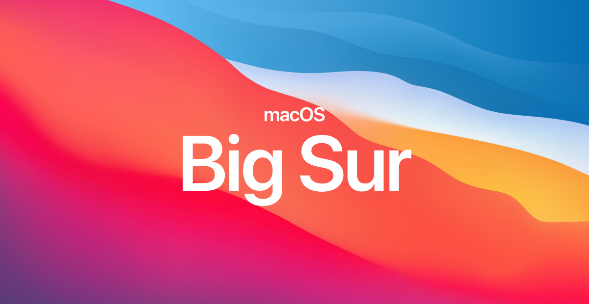
The largest tech company in the world recently launched new software. There are problems with Apple’s Big Sur, but let’s look at a few UX decisions they (mostly) got right. 1. User-first Emphasis on the UI was reduced in order to keep the focus on the user’s content. Buttons and controls appear when needed and recede when they’re not. Border and bezels have been softened or removed. The interface is there to serve the user—it shouldn’t draw attention to itself. Remove visual complexity & increase the signal to noise ratio. 2. Privacy & transparency Tracking prevention and transparency have been added to Safari. Inspired by food nutrition labels, new privacy information on the App Store lets you see a summary of the privacy practices of each app before you download it. Put privacy and transparency first. It’s in the best interest of your user. 3. Drill down on key workflows Apple clearly had a goal to improve the Messages app. There are now pinned conversations, better search, inline replies, mentions, and the ability to find GIFs. They know Messages are an important part of their platform. Invest time and effort in improving key tasks & flows in your product. It’ll pay off in the end. 4. Uniformity across services The Control Center and Notification Center changes are meant to create consistency through the ecosystem. There’s also new unified line of symbols. Some of the visual changes, though, like the new app icons, don’t match up with iOS 14; hopefully they’ll fix that. Maintain consistency and adhere to your own standards. It reduces cognitive load, makes the UI learnable, and gives a feeling of familiarity and confidence. 5. System status visibility Multiple updates and standardizations were made to top-level UI’s, including the Control Center, widgets, Spotlight, and the Notification Center. These changes make system status clear, easy to find, and customizable. Quick access to general system controls and information makes an interface feel reliable and predictable, and builds trust. 6. Stick with what’s familiar When redesigning dock icons, Apple consciously tried to retain the personality from the original. There are lots of new UI sounds as well, which were literally built on top of snippets of the originals so that they sounded familiar. When doing a redesign, remember Familiarity Bias: people prefer familiar experiences. It’s best to build off what you have rather than make an entirely new experience. 7. Clear visual feedback The Dock and Menu Bar have a new interface that allows you to customize where controls show up. The method they use of visually showing the user exactly what will happen is not only satisfying, it’s a very effective form of communication. Clearly communicate the consequences of decisions, preferably visually. Thanks! What do you think of Big Sur so far? What could they have done better? If you’re feeling generous, perhaps share the thread on Twitter: All images from apple.com or my computer. Originally posted on learnuxd.io .