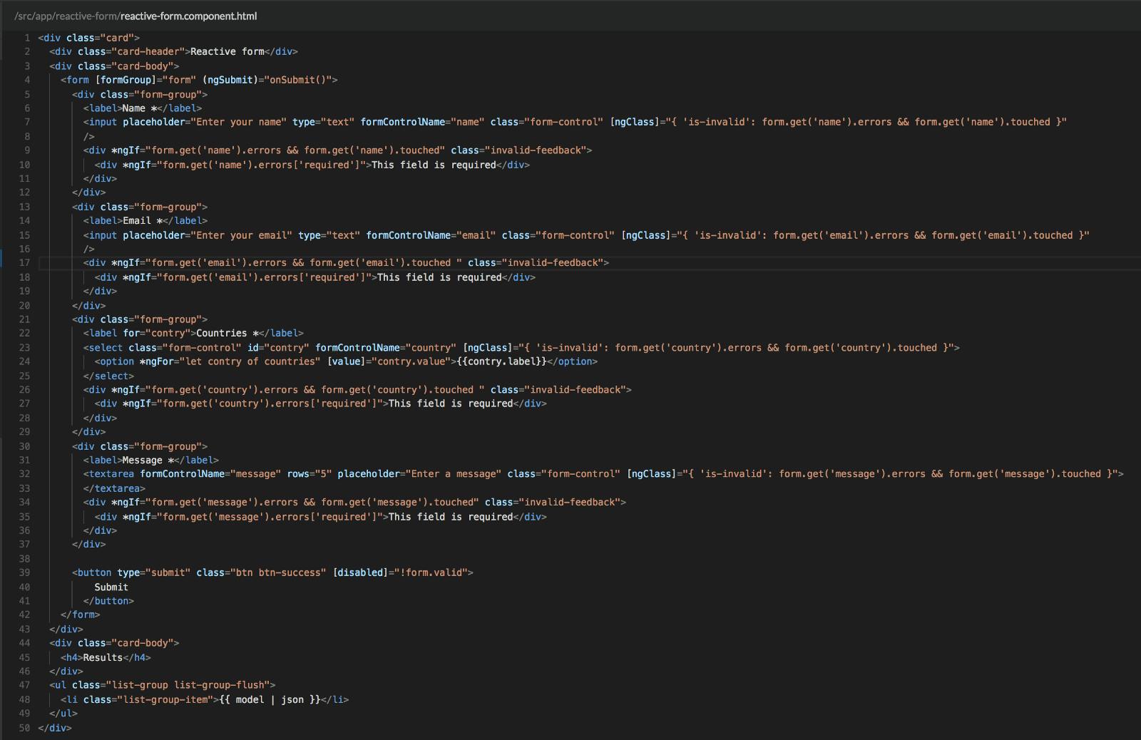
Creating forms is one of the most common works in the Frontend world. Angular with its reactive forms helps developers create, organize and control forms with an apprehensible workflow (Did you try to create forms validation using vanilla javascript?). Think of a regular user story where the product owner asks you to create a journey which includes forms with more than 20 different fields, a couple of combo validations, repetitive wrappers, and multiple steps. At this point, you should imagine how long the template will be and the component which holds the main form information. (How long would that code be in HTML?). Fortunately, there are a couple of open source Angular projects which that give you a nice solution for your application forms, focusing on the maintainability, scalability and decoupling of your code. (Check and ) Formly Angular Schema Form On this post, I’ll be talking about a really cool library which will help you in this task. Also, I’ll be describing a good way to organize your code using some awesome Javascript techniques. “NGX Formly” What is NGX Formly? is an Angular library to create reactive forms based on a configuration object. On Github, you can find all the different versions of this library, which include support for AngularJS. NGX Formly In others words, it helps you transform the template of an application from this: To this: Formly form HTML How to get started If you want to start working with this library, I recommend starting with their documentation site. It includes several well-created code snippets which will help you start using you can find the quick start guide. NGX Formly. Here Organizing your Formly Applications The complete process could be summarized in three steps: This module contains all the logic required to start using Formly. It includes module imports, the Formly configuration, validators, wrappers, new form elements, helpers classes, the service, and the form schematics. 1. Generate an “uiForm” module. With the given configuration, you need to import this configuration on the project and inject the required services in the correct place. In a regular Angular project, the services should be provided in a feature module. 2. Import the “uiForm” module in your application. With everything in place, the final step is to start using our schematics service to get the fields configuration and start creating amazing forms. 3. Create a component, inject the schema service and start using Formly. Creating the “uiForm” module As a regular rule, every Angular project should include a folder which holds all the modules to be shared. You should put this code in the correct folder. On this example, I’ll create a folder under called . “/src” “/src/ui-form” 1. To achieve this configuration we need to have the following structure: $: ui-forms/ui-forms.module.ts$: ui-forms/config.ts$: ui-forms/ui-forms.service.ts$: ui-forms/helpers$: ui-forms/wrappers$: ui-forms/types$: ui-forms/schemas 2. Create the . ui-forms.module This is a configuration module that exposes all the classes required to start using Formly. You can see this module as a wrapper of your forms, where you create all the forms elements and give you the chance of generating forms without touch your business logic. Your imports should look something like this: Notice how I included as a dependency. This was done due to having an input mask is a common task when you’re working with forms. Also, I created different import sections to differentiate each type of component, this is not required but it makes your import section more organized and allows these dependencies to be used as an index of this module. TextMaskModule 3. Generate the configuration file At the same level of the module, you should create a file named , it should include the Formly configuration which includes the types, wrappers, validators, validation messages, manipulators and extras. This configuration should be typed according to the interface imported from: config.ts ConfigOption { ConfigOption } "@ngx-formly/core"; import from Let’s start creating the validators message: This property allows you to create custom messages. For example, if you want a custom message for “maxlength” validation, the configuration object allows you to create a function which receives the field and the error as parameters and should return a string with the generated message. Check the following example: maxlengthValidationMessage(err, field) { `This value should be less than ${field.templateOptions.maxLength} characters`;} function return config = {validationMessages: [{ name: 'maxlength', message: maxlengthValidationMessage }]} const In order to have the house clean, those functions should be included in a separated file. In this example, the file was created inside . When this file starts increasing in size, you should split it into different files. On this project, all the functions will be present in the same file. ./helpers/* When you are done with the validations messages, the next step is to start creating the custom validators. This configuration requires custom functions which return null if there is no error and an object to specify the error. customValidation(control, type) { (/** Error validation */) { { customValidation: 'Custom error message' };}} export function if return /** There is no error */ ;} return null config = {validators: [{ name: 'customValidation', validation: customValidation }]} const In the same way of the validators message, you should create a file for the validators. On this example this file is into an was named as ./helpers/* validators.ts 4. Generate the wrappers components. The wrappers are Components which wrap a form group. This is required to manage all the forms actions or if you want to display custom errors. A wrapper component looks like: ({selector: 'formly-wrapper-title',template: `<h3 class="title">{{ to.label }}</h3><ng-container #fieldComponent></ng-container>`,styleUrls: ['./formly-wrapper-title.component.scss']}) PanelWrapperComponent FieldWrapper {@ViewChild('fieldComponent', {read: ViewContainerRef}) fieldComponent: ViewContainerRef;} @Component export class extends Notice this is a regular Angular component which extends of the class. This gives you access to the following variables: FieldWrapper form: ;field: ;model: ;options: ; key: ; formControl: ; to: ; showError: ; id: ; formState: ; FormGroup FormlyFieldConfig any FormlyFormOptions readonly string readonly AbstractControl readonly FormlyTemplateOptions readonly boolean readonly string readonly any With those variables, you have total control of the form. These variables allow you to generate buttons with form actions (submit, reset, etc) or generate custom error messages. The most used variable here is . It gives access to all the properties defined on . “to” templateOptions 5. Generate the types. The types are form element components. There are two different types: Types related to a static form element, and Dynamic types. The first one should extend from the class and the second one should extend from the ; FieldType FieldArrayType A new type looks like: { Component } '@angular/core'; { FieldType } '@ngx-formly/core'; import from import from ({ : 'formly-new-type', : `<div class="form-group"><input type="text" class="form-control" [formControl]="formControl" [formlyAttributes]="field"></div>`,}) FormlyNewType FieldType {} @Component selector template export class extends In the same way than wrappers, the class gives access to the same variables that class does. So here you can display custom error messages related to the field or generate custom styles. FieldType FieldWrapper 6. Generate the schemas. Once you set up all your project with the validation message, validators, wrappers, and types, it is time to generate the first form schema. Inside the folder, you need to create a form object which holds all your form configurations. It looks something like this: “./schemas/*” As you can see FORM_VALUES is a function which allows you to generate different configurations in your form object. In this example, I’ll generate a dynamic field with the disabled form property. To generate the form schema a new Field class was created. This class allows you to generate the basic form configuration for each field in a logic order. You can find this class as a new helper at . “./helpers/Fields.ts” This class looks like: Field { (type: ,key: ,templateOptions?: ,options?: ): { {type,key,templateOptions,...options};} export class public static field string string FormlyTemplateOptions any FormlyFieldConfig return (key: , templateOptions?: FormlyTemplateOptions, options?: ): FormlyFieldConfig { . ('input', key, templateOptions, options);}} public static input string any return this field As you can see, this class has different methods which help you in the field configuration. Using this class, the field configuration should look like: import { Field } from '../../helpers/fields'; export EMAIL = (disabled) => ({... .email('email', // key{ // Template Optionsplaceholder: 'Enter your email',required: true,disabled: disabled})}); const Field And a form schema should look like: import { , } from './form-elements'; PERCENTAGE_INPUT MONEY_INPUT MONEY_FORM = (disabled = false) => ({ : 'MONEY', : [{ : 'money', : ['panel'], : {label: 'Formly'}, : [ (disabled), (disabled)]}]}); export const id template key wrappers templateOptions fieldGroup MONEY_INPUT PERCENTAGE_INPUT At the end what you have three different objects: 1) The first object (EMAIL) is required to describe a single form element, 2) The second object is to create a form group (MONEY_FORM) and assign a form group identifier, 3) The third object (FORMS_VALUES) is to map all your forms by id. 7. Generate the ui-form.service.ts We need this service to ensure that a new instance of the collection is created. Remember Arrays and Objects are passed by reference. In that way, When the application needs the form configuration a new instance of the collection should be generated. This can be done with the following code: generateCleanConfiguration(clone: object[]) {return ( (clone));} JSON.parse JSON.stringify Using our Formly configuration Finally we are ready to start using Formly. To do that we need to generate a new Angular component, setup our HTML with the formly directives and get one of our form schemas. It looks something like this: /** HTML */ <form [formGroup]="form" (ngSubmit)="submit()"> </form> <formly-form [model]="model" [fields]="fields" [form]="form"></formly-form> /** Component */import { Component } from ' ';import { FormGroup } from ' ';import { FormlyFieldConfig } from ' -formly/core';import { FormlyService } from '../ui-form/formly.service'; @angular/core @angular/forms @ngx ({selector: 'app-formly',templateUrl: './formly.component.html',providers: [ FormlyService ]})export class FormlyComponent {public = new FormGroup({});public : FormlyFieldConfig[] = [... ()];public model = {} @Component form fields this.formlyService.getDefaultForm constructor(private formlyService: ) {} FormlyService } As you can see, with our set up in place, the only things needed to generate forms are 1) One reactive form, 2) One field configuration using our and 3) One object to store the form model. ui-formly.service The working project You can find a working example with this configuration here. On that example, you can check the difference between a regular Reactive Form Component (see folder) and a Formly Component (see folder). “./reactive-form” “./formly” Working reactive form + Formly Thanks for reading, please follow me on Medium and or send me a connection request on . Twitter LinkedIn


