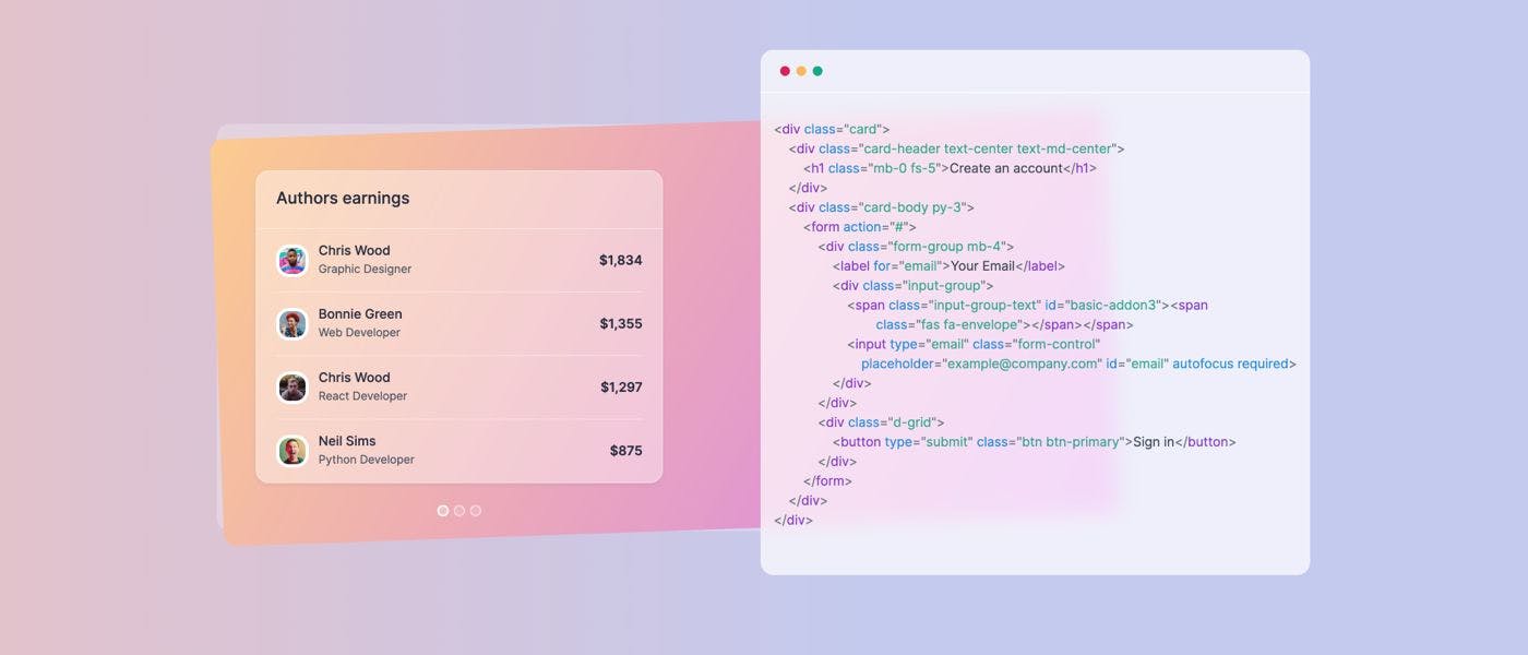
You might be thinking - another design trend? Don't we have these every year or so? Last year we got introduced to neumorphism, which still is quite a controversial trend that never really got massively adopted. Reactions were mixed, some people really liked it, and some others downright rejected it. But let's talk a bit more about glassmorphism. What is glassmorphism? Glassmorphism is a new design trend that makes use of a transparent background and a blur effect on top of the background to create a glassy effect. Here's an example: This is an example from an upcoming CSS UI library based on glassmorphism, called . ui.glass As you can see, the effect is being used for the card that contains the code example on the right side, in contrast with the other card in the background. Another example is this redesign of the Facebook Messenger App using glassmorphism for MacOS: The redesign was made by on Dribbble. Mikołaj Gałęziowski Glassmorphism is also used by Apple and Microsoft This is another reason why this trend is probably not just passing by, but it is here to stay. With the release of the Big Sur update for macOS, it was the first large-scale adoption of this new design trend by a large company. Microsoft also uses this style in the , but they call it "Acrylic Material", instead of glassmorphism. Fluent Design System Here's how it looks: Okay, so now that I've briefly introduced you to glassmorphism, let me show how you can apply this effect using only HTML and CSS. Getting started All you really need for this tutorial is a code editor and a web browser. You can also write this code using only editors, such as Codepen. The element that we're going to build will look like this: Let's start by creating an HTML file with the following code: <!DOCTYPE html> <head> <meta charset="UTF-8"> <meta http-equiv="X-UA-Compatible" content="IE=edge"> <meta name="viewport" content="width=device-width, initial-scale=1.0"> <title>Glassmorphism effect</title> </head> <body> <!-- code goes here --> </body> </html> < = > html lang "en" Great! Now let's also add a custom font style by including Inter from Google Fonts: <link rel= href= > "preconnect" "https://fonts.gstatic.com" < = = > link href "https://fonts.googleapis.com/css2?family=Inter:wght@300;400;500;600;700&display=swap" rel "stylesheet" Set up some basic styles and a background for the tag: body body { : rem; margin: ; background: #edc0bf; background: linear-gradient( deg, #edc0bf ,#c4caef %); font-family: , sans-serif; } padding 4.5 0 90 0 58 'Inter' Good. Next up, let's create a new card element that we'll later use to apply the glassmorphism effect on: <div = > <p>A modern CSS UI library based on the glassmorphism design principles that will help you quickly design and build beautiful websites and applications.< a> class "card" Glassmorphism is awesome < = > h3 class "card-title" </ > h3 /p> <a href="https:/ /ui.glass">Read more</ </ > div Of course, this could be any card element. You can use it for pricing cards, blog cards, profile cards, anything you'd like. Before we actually apply the glassy effect, let's first tidy things up with some spacing and sizing styles: .card { : px; height: auto; padding: rem; border-radius: rem; } .card-title { margin-top: ; margin-bottom: rem; font-size: rem; } p, a { font-size: rem; } a { : # d4ae8; text-decoration: none; } width 400 2 1 0 .5 1.2 1 color 4 Great! Now that we've laid down the foundation for the effect, let's see how we can apply it. Glassmorphism effect using HTML and CSS You only need two important CSS properties to apply the effect: a transparent background and the properties. The amount of blur or transparency can be changed based on your needs. backdrop-filter: blur(10px); Add the following styles to the element: .card .card { background: rgba( , , , ); -webkit-backdrop-filter: blur( px); backdrop-filter: blur( px); } /* other styles */ 255 255 255 .7 10 10 But you might be asking, where's the effect? You don't see it yet, because there is no shape or image behind the card. This is how the card should look like right now: Let's add an image just after the opening of the tag: body <img = src= alt= > class "shape" "https://s3.us-east-2.amazonaws.com/ui.glass/shape.svg" "" Then apply the following styles to the element using CSS: .shape .shape { : absolute; width: px; top: rem; left: rem; } position 150 .5 .5 Awesome! The final result should look like this: If you want the code for this tutorial, check out this . codepen Browser support One of setbacks of this new design trend is that Internet Explorer does not support the property, and Firefox has it disabled by default. backdrop-filter Other than that, all major browsers support the properties necessary to create the glassmorphism effect. You can check out the support browsers on . caniuse.com Conclusion I hope that this article was helpful for you to understand more about this new design trend and how the effect can be achieved. Me and my friend from Themesberg have been working on a new CSS UI library that will be using the new glassmorphism design trend, called . It will be open source under the MIT license. ui.glass You can sign up to get updates about progress and be notified when the project will be launched. It will be available via NPM and also CDN. Thanks for reading! Leave your thoughts in the comments section below about glassmorphism.
