
371 reads
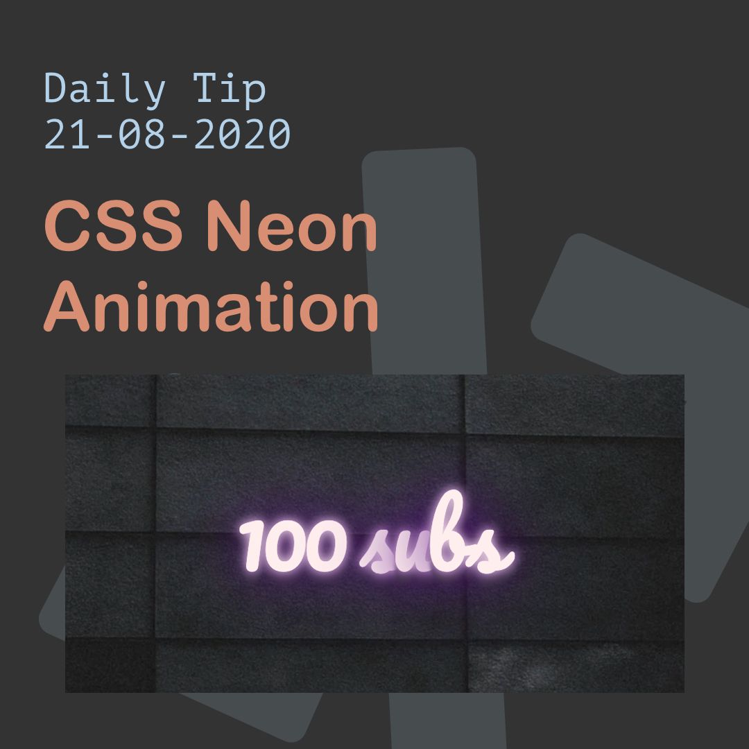
How To Create CSS Neon Animation
by byDaily Dev Tips@daily-dev-tips
https://daily-dev-tips.com I write daily dev tips to contribute to the development community!
August 21st, 2020


https://daily-dev-tips.com I write daily dev tips to contribute to the development community!


https://daily-dev-tips.com I write daily dev tips to contribute to the development community!
About Author
https://daily-dev-tips.com I write daily dev tips to contribute to the development community!
Comments


![10 Best Anime Websites to Stream & Download [Free + Paid]](https://hackernoon.imgix.net/images/TggSxk7kWsMlczkuVtR0LstDzEG3-1993oxm.jpeg?auto=format&fit=max&w=3840)
