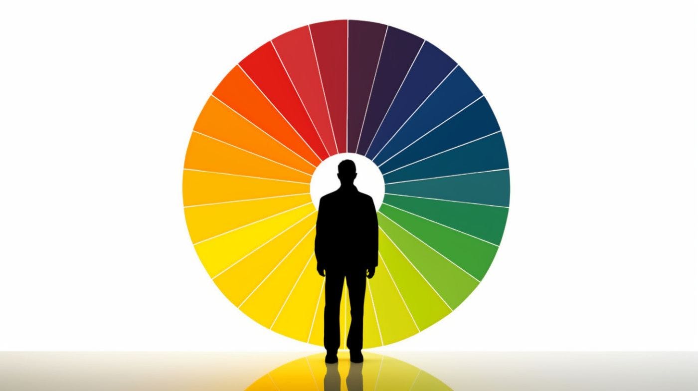
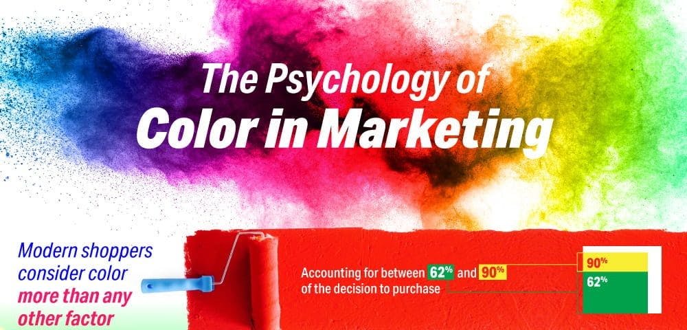
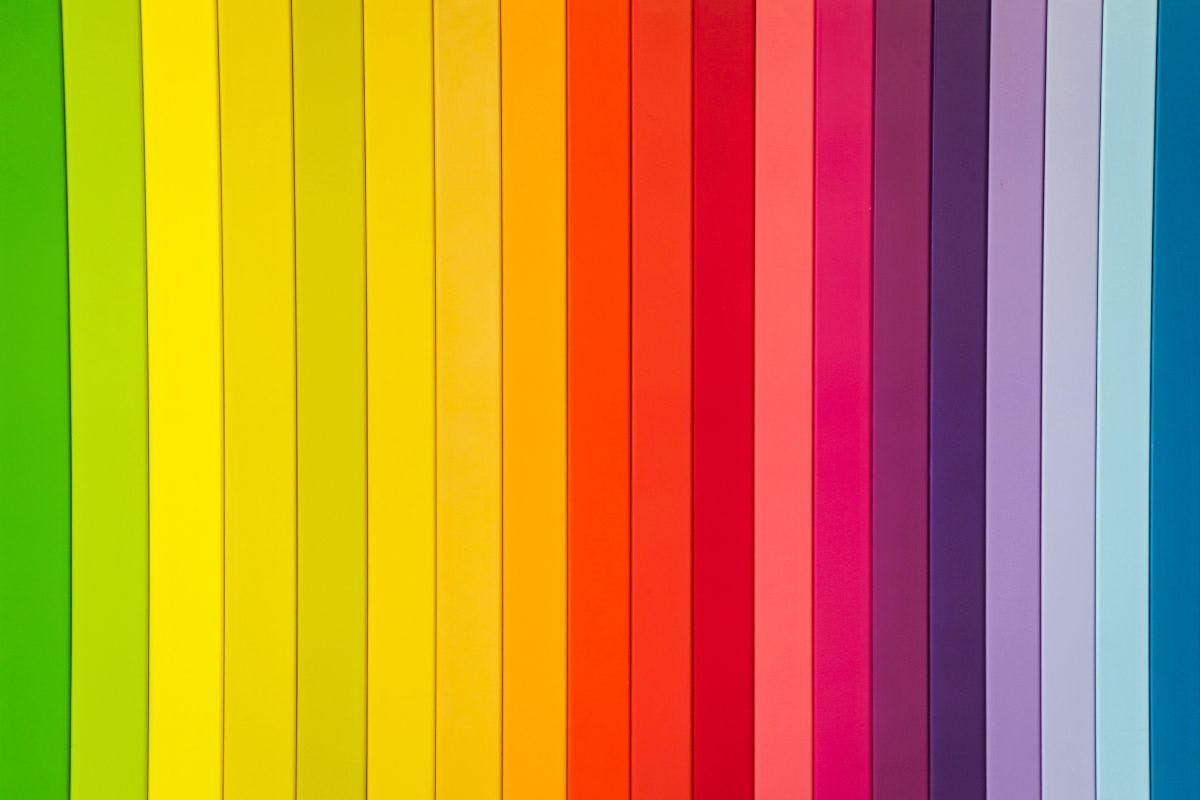
Introduction In this article, I will talk about the theory behind selecting fonts and colors for brand identity and advertising and how you can use the specifics of human psychology to influence your choice and maximize the brand impact of your business. Let’s go! Color Let’s start by taking a look at the first thing your target audience will notice before their brain makes sense of what it’s seeing: color, which is governed by color theory. Color theory is the collection of rules and guidelines which designers can rely on to build interaction with users via appealing color schemes in visual interfaces. A well-picked color combination can go a long way in communicating the company image that you want it to project. Remember that color needs to maintain consistency across the logo, the website, and brand’s ad campaigns on social media and outdoors. Color theory is intertwined with the psychology of color, which makes people feel a certain way or compels them to perform actions. Scientists have been studying the effects of color on people for decades, and the first color matrix was developed in the 1990s. It defined the major color groups and described the most common effects they have on consumers of certain brands that use color in their public image. White White is the standard background color. It’s minimalistic and fresh and demonstrates meticulousness and attention to detail. White packaging is used by nearly every major tech company for its products (think Apple, Microsoft, Google, Samsung). High-quality white packaging is expensive to manufacture, which adds to the superficial appeal of those products. While clearly communicating cleanliness, it is also simple and direct. Red Red has historically been associated with kings and telegraphs high status and readiness for action. It’s the color of passion and energy but also of danger, powerful emotion, and appetite. You may find major clothing retailers, such as H&M, jewelry manufacturers, and entertainment companies sticking with red to energize and invite audiences into their retail spaces or experiences. Likewise, many food brands choose red to attract attention. Orange This warm and inviting color is linked to childhood memories, sunshine, and summer. It’s the color of choice for many mass-market brands belonging to retailers, consumer electronics manufacturers, and businesses that market to kids, like Nickelodeon. Gold and lemon shades demand attention and spark creativity. Green Green is the color of nature. It’s refreshing, calm and promotes a healthy lifestyle. Many household products use green in their packaging to highlight eco-friendly properties and make the product appear more natural. Blue Based on an , blue appears to be most people’s favorite color. It’s no wonder that it projects trust: it’s the pick for medical companies, internet businesses, financial institutions, and masculine brands. investigation by the BBC In addition to that, bottled water companies almost universally use the blue color to denote the purity and quality of their bottled water. Purple Despite having its origin in nobility and high class, purple is a shade with a cozy feel that feels right at home with brands that promote furniture, comfort food like snacks, and affordable retail items. Some brands manage to successfully leverage the color’s royal charm by appealing to the customers’ fantasies, such as Hallmark and Lifetime. By using the right color, you can zero in on your target audience quicker and create a powerful brand with a magnetic presence. If you sell products, keep in mind that most people will prefer a product with cleaner packaging with more pleasant colors, and cultural background, personal preferences, experience, and mood will inform that choice. When designing packaging or branding in general, ensure the colors remain compatible by using complementary, split complementary, or tertiary colors. Complementary Complementary colors reside on the opposite sides of the color wheel. The most widely known complementary color combination is the good old red and blue. They look bright and prominent when used together. Split Complementary Split Complementary relies on one base color and two secondary colors placed symmetrically around the color wheel. This method produces eye-catching combinations for complex branding and illustrations that feel organized and harmonious. Tertiary Tertiary colors happen when you combine primary and secondary colors on the color wheel. For example, mixing yellow and orange, red and purple, or blue and green. Use this method to create a more diverse color landscape for your branding and communication materials. Typography Now let’s talk about typography, the study of making copy legible to the reader. Compare these two logos of famous brands with color removed and see for yourself which one of them comes off as playful and which one is serious. To take advantage of typography’s effect on the perception of the brand, we need to take a step back and define some of the major font categories. Sans Serif Sans Serif fonts are universal, optimized for web rendering, and look fantastic in print ads with paragraphs of text. They owe their incredible versatility to their lack of “serifs” - small lines, dashes, and other graphical quirks that weigh down legibility. Sans Serif fonts may come in blocky styles, which project rigidity and strength, or rounded ones, which suggest personal comfort, safety, and approachability. Handwritten Both historical and rising brands have also been using handwritten fonts designed to emulate a real person’s pen strokes. These lend themselves well to casual brands or brands marketing to fashion-conscious consumers and replace all the seriousness with all the fun. They can also add a personal touch to any product. Serif Serif fonts are classic and traditional. They are commonly found in logos of legacy brands with storied journeys across the decades. Serifs demand respect but don’t necessarily look great on screen because of their ornate detail compared to screen-native sans-serif fonts. Still, a good serif font will translate well both on screen and in print - if used well. These serif fonts are in style - use one for a high-contrast brand page or a bold print ad. Logos More and more companies are ditching iconography altogether in favor of going with a text-based logo. In fact, only about 6% of all logos still have an icon, while 56% of them use both icons and text, and a rising group of 37% stick with just a text logo. Recently we have seen an uptick of brands switching from elaborate fonts to simpler sans serif faces across industries like tech and fashion. Stand out from the crowd - over 21% of all logos use the ubiquitous sans serif font Helvetica, so don’t use it unless you have a very good reason to. Where iconography is still present, square logos promote the security of the company. Triangular logos get right to the point and call for action. Conclusion If you know your target audience, then keeping the right combinations of colors and fonts at hand to correctly communicate your brand identity to customers is half the battle won. Think carefully about the kind of product or service you are offering and the kind of values that your company promotes, and then use color and typography to make your brand speak for itself. Do not be afraid to experiment with shapes and forms to find the right combination, and keep in mind that there’s always room for improvement and a redesign - even if your brand has existed for a century.